ShopDreamUp AI ArtDreamUp
Deviation Actions

so DA has a new logo now... hmm... i like the old logo better
I honestly don't like the new one, just speaking my opinion. so many things about it just aren't pleasing to me.
1. the color
Why would they chose this odd slightly off mint green color? it's a bit annoying. it's the kind of color that if changed to be on the entire website as the back drop, it would give people headaches. it's an eye sore of a color.
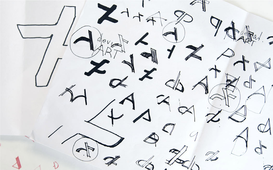
2. the logo shape
what is this exactly? i know it's some sort of half diagonal cut A .... but...really? it looks like a cross out of an equals sign, like DA hates equality, it could be any quality bashing. girls/guys gays/straits good artist/bad artist and so on.
if it doesn't look like a hate for equality then it looks like an effing Z.
3. the video
I had to watch the video they made to sort of understand what it was to begin with. and what is with that video??? every picture of art work on there is absolutely amazing. congrats to those artists, but come on DA you of all websites should know that an art community is not made up of the super stellar artists. there's more of us who are average artists or people entirely new to the game. why make a video for your website depicting the best of the best when they don't make up a majority of your website? this is where i go back to the whole "the new logo looks like a crossed out equals sign" rant. are they saying that other artists will never be as good as the amazing, or that they don't deserve the same recognition for just trying their best at doing art? and it isn't just the painted or drawn arts, every one needs to be seen as equal, the crafters, the cosplayers, the photographers, the story tellers, and the animators! we are one of the most diverse groups of people, the artist, we all need to be recognized not just the amazing flawless digital artist that DA seems to think so highly of (yes i know that there was a couple pf photography pictures in there as well).
the new logo is not something i like in the slightest. beside the stupid things like the color and looks, i think the video pissed me off the most.
i'm only doing my mood for DA love is because i love the old logo better!!
#oldDAplease
it has come to my attention that the not only is the logo stolen so is the font
Logo: platzkart.ru/
Font: www.gamer.ru/system/attached_i…
Concept logo: pbs.twimg.com/profile_images/1…
Concept logo again: img4.wikia.nocookie.net/__cb20…
this looks close to a concept design they had on their paper before the "train" wreck we have now. hell this one is even circled for you
www.da-files.com/artnetwork/ne…
any other things you'd like to tell us DA?
seriously!!! you guys go on here saying art theft is wrong, then do it your self? sheesh, no wonder the art theft problem on this website hasn't been fixed, it's being run by thieves.
check this little plz account made by katieline.deviantart.com/
if they don't go back to the old one, i would accept this
I honestly don't like the new one, just speaking my opinion. so many things about it just aren't pleasing to me.
1. the color
Why would they chose this odd slightly off mint green color? it's a bit annoying. it's the kind of color that if changed to be on the entire website as the back drop, it would give people headaches. it's an eye sore of a color.
2. the logo shape
what is this exactly? i know it's some sort of half diagonal cut A .... but...really? it looks like a cross out of an equals sign, like DA hates equality, it could be any quality bashing. girls/guys gays/straits good artist/bad artist and so on.
if it doesn't look like a hate for equality then it looks like an effing Z.
3. the video
I had to watch the video they made to sort of understand what it was to begin with. and what is with that video??? every picture of art work on there is absolutely amazing. congrats to those artists, but come on DA you of all websites should know that an art community is not made up of the super stellar artists. there's more of us who are average artists or people entirely new to the game. why make a video for your website depicting the best of the best when they don't make up a majority of your website? this is where i go back to the whole "the new logo looks like a crossed out equals sign" rant. are they saying that other artists will never be as good as the amazing, or that they don't deserve the same recognition for just trying their best at doing art? and it isn't just the painted or drawn arts, every one needs to be seen as equal, the crafters, the cosplayers, the photographers, the story tellers, and the animators! we are one of the most diverse groups of people, the artist, we all need to be recognized not just the amazing flawless digital artist that DA seems to think so highly of (yes i know that there was a couple pf photography pictures in there as well).
the new logo is not something i like in the slightest. beside the stupid things like the color and looks, i think the video pissed me off the most.
i'm only doing my mood for DA love is because i love the old logo better!!
#oldDAplease
it has come to my attention that the not only is the logo stolen so is the font
Logo: platzkart.ru/
Font: www.gamer.ru/system/attached_i…
Concept logo: pbs.twimg.com/profile_images/1…
Concept logo again: img4.wikia.nocookie.net/__cb20…
this looks close to a concept design they had on their paper before the "train" wreck we have now. hell this one is even circled for you
www.da-files.com/artnetwork/ne…
any other things you'd like to tell us DA?
seriously!!! you guys go on here saying art theft is wrong, then do it your self? sheesh, no wonder the art theft problem on this website hasn't been fixed, it's being run by thieves.
check this little plz account made by katieline.deviantart.com/
if they don't go back to the old one, i would accept this
Platinum Draakonian
You become the highest priority buyer with the best discounts and content access. Buying commissions with be nearly free to you!
$75/month
I Join YouTube
Warning Art Theft
I was recently told that a user on instagram https://www.instagram.com/astral.adopts/?hl=en has been stealing characters and selling them as adoptables, and that one such art work was of my furvilla paintie Opal the angel dragon . I warn every one of this account now, so that if your art ends up here without your permission you can report them immediately. none of my characters or their designs have ever been, or will ever be put up for sale as an adoptable. I am currently investigating more on this current issue, for now as a warning to EVERYONE that views my art. If you share, post, or try to profit from my art in any way without MY permiss
commissions OPEN
i'm still doing badge commissions, all ranging from 5$ to $30, Character reffs starting at $25, Prints 8.5in by 11in starting at $25, and Furvilla characters starting at $5.
Send me a note here, or on skype with the name Rain Feather. check my gallery for examples of some of my products.
Badge Commissions
I am now doing commissions for con badges I will have pictures of badge types I can do and links to them in this journal with prices. most badges are done in traditional media and will be laminated and come with a badge clip.
SEND ME NOTE FOR YOUR ORDER
I will also be making the trip to the Cashman center in Nevada to attend the craft fair during November 4th, 5th, and 6th. I will be sitting in my mom's craft booth selling custom character badges.
here is the link to the craft show's webpage: http://www.stevepowers.com/PUBLICSIDE/fallpublic.html
Small custom name badges $6
link coming soon
Small normal custom character badges $10
link
© 2014 - 2024 ilovemy3cats
Comments1
Join the community to add your comment. Already a deviant? Log In
Oh my : O